
This article was originally published in the International Doula magazine. This version includes a photo of the meeting with DONA International founders Penny Simkin, Annie Kennedy, and Phyllis Klaus to discuss the new logo. — Adrianne Gordon, MBA, CD(DONA), Blog Manager
The Inspiration Behind DONA’s New Brand Identity
Now that you’ve had some time to see the new DONA logo, we are excited to share more details about our new DONA International brand identity and the research behind it. We recently chatted with Public Relations and Marketing Director, Melissa Harley, to discuss our new look and what it means for our organization.
Hi, Melissa. Thanks for taking some time to speak with members about the new DONA International look.
My pleasure! It’s an exciting time to be a DONA International doula and member, and I am thrilled to share the work of the various DONA committees with our membership!
DONA International has a new logo and look. What motivated the changes?
Last year, the DONA Board of Directors started a rebranding initiative that began with extensive research of the DONA International membership, as well as the doula market in general. We wanted to get a feel for the things that are important to members before we started to implement changes or updates to the organization. After receiving and analyzing the data, with the help of our professional research partners, we were able to find very specific themes of information that helped guide us in our decisions. The themes included the following information:
- DONA members feel solid and grounded by their affiliation with DONA International.
- Our members are incredibly proud of the quality of their training and their certifying organization; they feel the DONA brand carries real meaning and value to them.
- DONA is trusted.
- DONA members are ready for a new, fresh and updated look.
- Members would like to see us focus even more in areas such as public advocacy, mentoring and business training.
So as you can see, members are ready for change; and DONA leadership has taken that very seriously.
Can you tell us about the new logo, and how the committee decided on the final version?
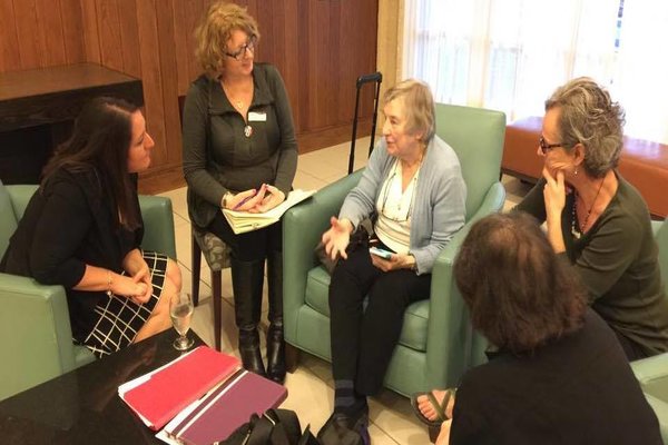 In January, DONA president, HeatherGail Lovejoy, and I met with three of the DONA founders: Penny Simkin, Annie Kennedy and Phyllis Klaus to discuss the new direction of DONA International. We were looking for their input and wanted to be sure to honor the history of our organization, even through our new direction. In that meeting, we were able to learn more about where the first logo originated, as Penny shared a bit about the interlocking hearts:
“The first logo was based on my original doodle and was used by DONA for a long time. It showed layers of open hearts. The essential ingredient of the doula is an open heart; many doulas mean many open hearts. It was first used in a book, Special Women, by Polly Perez, which I published through my publishing company, Pennypress Inc. The DONA board liked the illustration, and Polly allowed us to use it. Later, the board modified the logo, closing the hearts and making it bolder.”
During our meeting, HeatherGail and I were both amazed as Penny grabbed a napkin and demonstrated how she had once doodled the interlocking hearts of the original drawing. It was a special moment, and it became clear that the hearts were a significant part of the DONA history that should be honored as we moved forward.
 |
 |
|
| Original design by Penny Simkin, used in the book Special Women | Second iteration, more bold and solid used as the second logo for DONA International |
How did it all come together?
We started with the five founders, and we thought about their hearts for families, maternal health care and for DONA International. Working with our designer, the committee narrowed down the choices and went through several cycles of tweaks and changes before we ultimately ended up with the new logo. We loved it because the five hearts are there, woven together; they are interlocking, fluid and strong. Each heart represents a strong voice and a strong vision for DONA International and for the doula profession. Each heart represents why we exist and what we do. It is thanks to the incredible vision of the five founders that DONA is the largest and longest-standing international doula organization in the world, and that the word doula is now becoming common when used in conjunction with pregnancy, childbirth and postpartum.
 |
 |
 |
The new DONA logo mark honors our history but is unique and vibrant, ready for the next chapter of DONA International.
I want to recognize the exceptional team that worked on the logo. This team of committed DONA members led the way as we went through seven rounds of logo designs. Each round had ten or more logos to work with, and the team did an exceptional job narrowing it down to the final product. Committee members were Jessica English, Nikki Knowles, HeatherGail Lovejoy, Ana Paula Markel, Ravae Sinclair, Sunday Tortelli and me.
So, what’s next in the process?
Now that International Doula is published, a new look for the eDoula is set to come out in October. Of course, we have the long-awaited website launch, and that should be happening soon, as well.
Over the next months we will also be updating our forms, nametags (available for purchase), certificates and all of DONA’s other materials. We will even be offering DONA swag for sale on the new website! I can’t tell you how excited our conference attendees were to purchase their new DONA t-shirts with the #DONAProud hashtag. The table was swarming with buyers, and we sold out by the second day of the conference, so we know our members want to wear and use DONA products proudly.
In addition, we will be implementing some significant changes to address the other themes from the survey. An advocacy committee is coming together now – led by Ana Paula Markel – that will help DONA International formally advocate for our doulas, for our families and for maternal health care issues.
Finally, our education department is developing revisions to our curriculum as well as looking at ways to increase our ability to mentor new doulas. We are making great changes!
Any final words?
As I’ve mentioned, this is a very intense, but exciting time for DONA International. As a nonprofit organization that has already greatly impacted childbirth through the work or our founders and members, we are exceedingly proud. To say it boldly, we are #DONAProud. But the vision and mission is ongoing, and we need our members to stand together and to work together. We invite members to serve on DONA committees. We want to stand together as we serve families, our communities and our organization, and as we continue to advance the role of the doula as an integral component to pregnancy, childbirth and the postpartum period.
Thank you all for your energy, creativity, and connectiveness! I’m new to this but LOVE it with my heart too.
Thank you Sally! Welcome to the DONA International family. – Melissa